Everyone on the web knows that hyperlinks are blue and underlined. Why do web sites stray from this easy usability must-have? I’m not saying the links on every site MUST be blue and underlined, but they absolutely should be clearly formatted so they stand out from the normal text. Vague link styling is easily my biggest pet peeve for web sites. Sounds like a silly concept right? But visitors can become frustrated with a website if they can’t find information quickly and easiy.
Having text that is clearly identifiable as a link helps your users find the information they need fast, allowing them to scan your page for their next navigation decision. Also, this is a perfect opportunity for site owners to funnel their visitors into pages they want them to see – you are literally sending visitors into your conversion funnel.
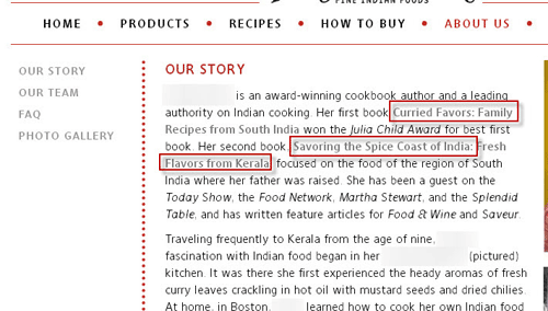
I came across a few examples of poorly formatted links recently, which inspired this rant post. Without calling out the companies, I’d like to share these examples, and for some reason they’re all about food.
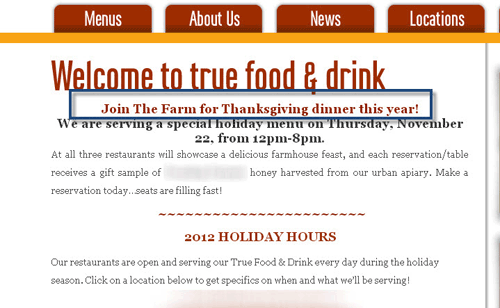
My wife and I were researching restaurants in DC where we could go for Thanksgiving dinner. I found a reputable restaurant, and found some information on the site about the menu, but the link into the details page was invisible – at least to my eyes. As you can see below, the text in the highlight box below is actually a link to a detailed page about Thanksgiving dinner. The visitor to the site only knows this is a link if they scroll over the text with their mouse – it shouldn’t be that difficult. Links should be obvious…


Flash is bad for SEO and bad for usability
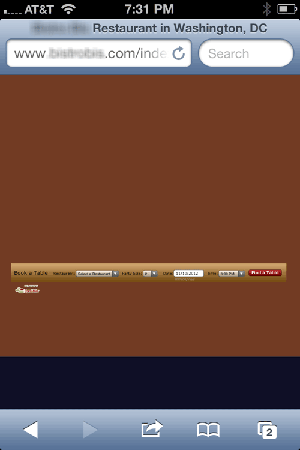
During the Thanksgiving dinner research I was doing a few weeks ago, I happened to navigate to a popular DC restaurant on my iPhone. I actually visited the site after receiving a recommendation from another restaurant, so my expectations were set a bit high. As I arrived at the site on my phone, here’s what I saw:

The other negative here is search engines hate Flash because they can’t access the content that resides inside the Flash animation. So, the restaurant site content is invisible to search engines and they’re missing a huge SEO opportunity to draw in new customers. Perhaps they don’t care to earn new business? Maybe they just don’t care about their customer’s experience, which is what I took away from the visit. Please people, do NOT use Flash to build your websites – it’s an SEO nightmare. Make sure your site is at least accessible on mobile devices. Mobile is an area I’m currently working on for this site. I’ll write another post later on why Responsive Web design is the way to go.
Use Clear Calls-to-Action
Here’s another area where this site needs improvement, but I do try to add a call-to-action at the bottom of each post. A call-to-action is simply content or a button that encourages users to do something on your site. Your site exists for a reason – to sell widgets or capture information – you should help your visitors take that action. A basic “buy now” button is an example of a generic yet clear call-to-action. Your visitors arrived at your site to solve a problem and your calls-to-action help them find the product or service you offer. Really, it marries together the searcher with a possible solution to their problem. Testing your call-to-action text is a crucial part of Conversion Rate Optimization. But again, that’s another post for another day.
Usability issues are part of the SEO site audits we offer. Contact us for an evaluation of how well your site is working.

Leave a Reply